After starting the Google Data Analytics Certificate course in October 2022, I decided I wanted to create a personal project for myself to showcase the skills I learned. I made the decision to perform a case study where I collected my commute data to work everyday from October 11th, 2022 to June 2nd, 2023. Below, you will find my analysis.
Case Study: Commute Analysis Scope of Work
This scope of work was created in December, when I began learning about how to outline projects. Students were given a template and I used this as an opportunity to intentionally think about how to realistically create deadlines for myself, as well as how to realistically layout a project.
Data Collection Spreadsheet
When I initially created this spreadsheet, I had the intention of only collecting the date, month, weekday, distance, ETA, and departure time to conduct my analysis. After experiencing a change in weather conditions throughout October and November, I decided to collect data on temperature and weather conditions to see if there were any correlations between that and ETA.
After processing and cleaning the data, I created two pivot tables for monthly and weekday data to analyze various variables. Below is a list of discoveries that were made using the pivot tables.
Weekday Discoveries:
- Tuesday had the shortest average distance traveled
- Friday had the highest average distance traveled
- Friday had the shortest average ETA
- Tuesday had the longest average ETA
- Friday had the lowest average temperature
- Tuesday had the highest average temperature
- Friday had the lowest unique count of weather conditions
- Tuesday had the highest unique count of weather conditions
Monthly Discoveries:
- February, January, June, and October tied for shortest average distance traveled
- March had the highest average distance traveled
- June had the lowest overall distance traveled with 20 miles. November came in second place with 121 miles traveled.
- March had the highest overall distance traveled with 239 miles
- December had the lowest average ETA
- October had the highest average ETA
- December had the lowest average temperature
- October had the highest average temperature
- June had the lowest unique count of weather conditions of 1. December came in second place with the unique count of 3
- March had the highest unique count of weather condition of 7
After using the pivot tables, I then went on to create a new sheet to perform calculations to find specific measurements from the overall data rather than focusing on monthly and weekly data. Here are key metrics from those findings:
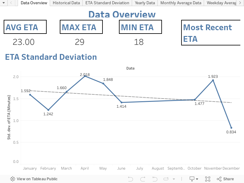
- The average commute time from Garden Grove, CA to Santa Ana, CA in the time period of October 2022 to June 2023 was 23 minutes
- The average weather condition was Fair
- The average temperature was 55 degrees Fahrenheit
- Average distance traveled was 10 miles
- total distance traveled was 3,036 miles
For more detailed analysis findings, please visit this document: Analysis Findings
Case Study Data Viz from Tableau
Once I was finished with analyzing the data, I went to Tableau public to begin creating visualizations. After exploring all of the data I had collected, I learned two key data points:
- Weather Conditions and Temperature did not affect my ETA. In fact, rainy conditions made my commutes shorter than the average fair weather condition days.
- My departure time had a direct correlation with ETA. The later I left, there was a higher chance of more traffic.
After making these two key discoveries in my visualizations, I decided to use ETA and departure time for my two measurements. If you would like to visit the Tableau public dashboards, click this link: Case Study: Traffic Commute Analysis Tableau Dashboards
Conclusion
After completing this case study, I learned some very interesting and cool facts about commuting to my previous job:
- If I would like to avoid major traffic congestion, I need to leave by 7:00 AM the latest. By doing this, I give myself a 20-30 minute commute buffer to arrive at work on time.
- Anytime left after 7:00 AM will result in a 30+ minute commute.
- March had the some of the highest measurements because this month had the most instructional days of the school year. There were no holidays or duty-days that created three day weekends for staff and faculty.
- June had the lowest measurements across the board due to only working two days of this month.
- April had the lowest minimum ETA. All school districts in my area do not have aligned spring break schedules, therefore there were less people on the road commuting to work this month.
- Harbor Blvd was the exit taken the most out of the two exits because I preferred this route over the I5-Broadway exit.
- Harbor Blvd exit had a higher average ETA because there are more stop lights and service street traffic versus the I5-Broadway exit.
Further Exploration
If I were to dive further into this project, I would love to see what traffic patterns are for people who are coming from the opposite direction as me. Instead of starting in Garden Grove, CA, I would start somewhere southwest of Santa Ana, such as Tustin, Irvine, or Costa Mesa, CA. I would love to compare and contrast how starting in a different place and traveling the opposite direction would impact a commute trip.
Case Study Changelog